Branding
Chicago History Museum
CHM's mission is to make Chicago a better place for everyone by helping people make meaningful and personal connections to its history. Ironically, the museum needed a modern visual identity to remain relevant to its changing audience. Our approach hinges on the idea that looking back to learn from our collective pasts is an act of moving forward. We took cues from the new building's streamlined design to influence our mark's styling and employed a clean and immediate typeface to convey modernity in the museum's updated curation approach.


Above is the strategic tool used to define the brand’s position and inform our design.

The application of the new brand mark gives CHM’s stationery a fresh look.

Hepburn Group, LLC
Our challenge was to convey the larger-than-life personality of British contractor Tony Hepburn. The idea of combining The Union Jack with bulldog came quickly. Adding a hammer occurred while refining our comps. Like design magic, we had created a mark to remember. It fits the brand to a tee; distinctly English, dogged, well-crafted, and modern.


The mark is proving to be distinctive and building trust in the Hepburn Group’s craftsmanship to potential clients.
The Forward Campaign
Looking to find a logo to reflect the mission, we created to this mark simply and powerfully uses converging lines to symbolize Housing Forward’s path ahead. The addition of a chimney acts as a double entendre that speaks to our goal of providing housing to those in housing crisis.


Enhanced Recovery StyleScapes
A more efficient way to reinvent a brand’s visual identity is to use style scapes. Each board illustrates a slightly different personality by showing a palette, typography, and found graphic and photo stylings at a glance. This step allows the team to use more time developing unique assets for the brand than finding its way by creating original assets blindly. Once the style is set, we create platform ideas and assets that brands can use to create graphic standards, create packaging designs, and conceive advertising campaigns.

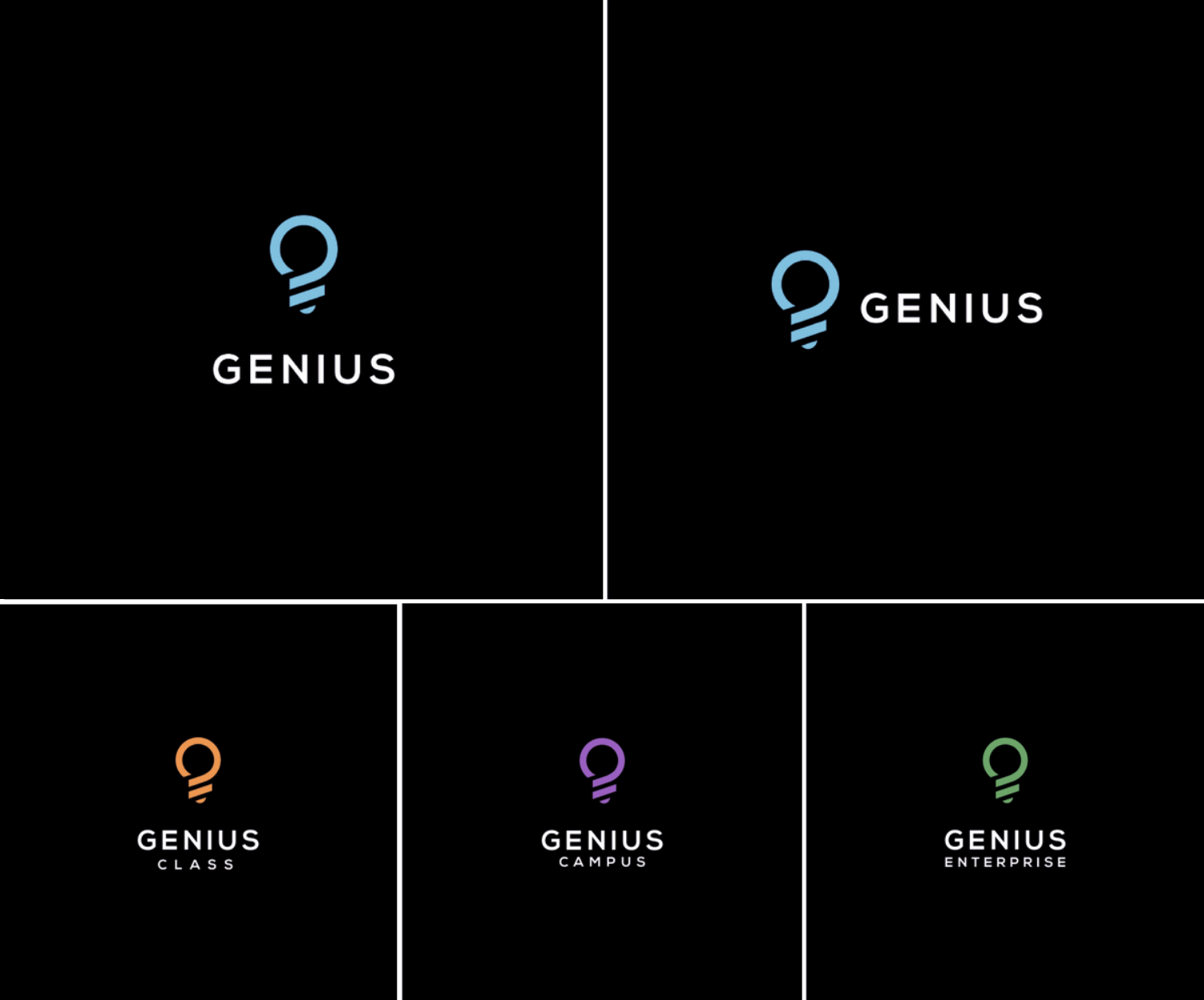
Genius SIS
In 2020 learning institutions at all levels were catapulted into online teaching. This created the increasing need to manage student information in a completely different way than the traditional brick and mortar school environment. Our client, Genius, had truly built a better Student Information System (SIS), but needed to build their brand and drive awareness of their offering in a competitive environment that included some large, established companies. They started by updating their brand mark to a system that included all of their divisions.
Westport brewing
A highly-crafted beer demands a highly-crafted brand mark. Westport Brewing, located in a historic district, is housed in a 125-year-old bare brick and beams warehouse. We used etched illustrations and distressed fonts to reflect this brand’s sense of heritage.
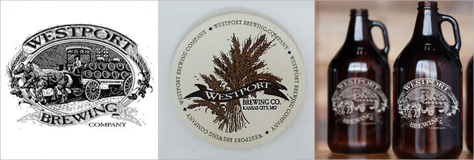
Due to the high level of detail in the logo, we created secondary logo marks for ease in printing high-volume, low-fidelity printed collateral like coasters, hats, and shirts.
Carnival Artisanal Bakery
A blue elephant with European circus ornamentation? What else could we have created for a French-trained Bangladeshi baker creating baked goods at a grocery store named Carnival? The distinctive backgrounds and details spoke to the care taken in the backing of this product line. The bright palette grabbed shoppers’ attention and the results showed at the register.
